Color POP! How To Add a Pop of Color To Your Wedding Flowers
In a world of neutrals and grays, adding color to your wedding flowers might seem a bit scary, Fleur + Stitch is here to guide you through those choices and help it look effortless! Check out our list of do's and don'ts for every color lover. Whether you'r going all out or just a single pop, here's our list to make it successful:

Choose a single pop of color:
DO add a single pop of color to whites, creams and other pastels. It can be just enough to satisfy everyone's pallet.
DO add pastels in the shade that you have chosen. Adding pastels makes the color flow seamlessly from bright to white.
This Gorgeous bouquet was modeled by Prep of Boston, Katherine and Shot by Catherine Threlkeld Photography at Peabody Essex Museum. Click through the Gallery to see more.
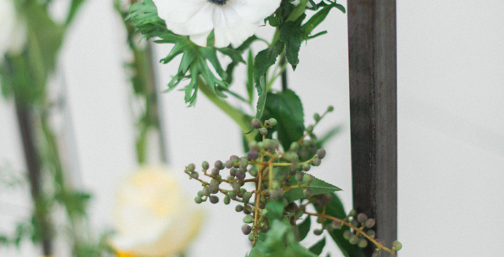
We used bright yellow ranunculus for our shot of color and then used soft yellow 'Creme de la Creme' roses to help soften the tone and blend it with the white anemones, white Gomphrena and white Veronica. Other flowers/textures used: Phalenopsis, Jasmine vine and Steel Berry.
DON'T use a single shade. While I'm a big fan of monochromatic, you need to mix in multiple shades of your color to give it depth and dimension. Only using one shade can sometimes fall flat and appear uninteresting.
Choose Two Pops of Color:
DO choose colors close to each other on the color wheel. Choosing colors too far apart on the color wheel can be harsh to your eyes. While choosing opposite colors on the color wheel can work, it takes a master of color (and flowers!) to make it seem pleasing and flow seamlessly.
DO incorporate pastels in both of the shades that you have chosen. I may sound like a broken record, but I can't stress this enough; adding pastels in the shades of color you choose, softens the pallet and makes it seem harmonious to the eye.
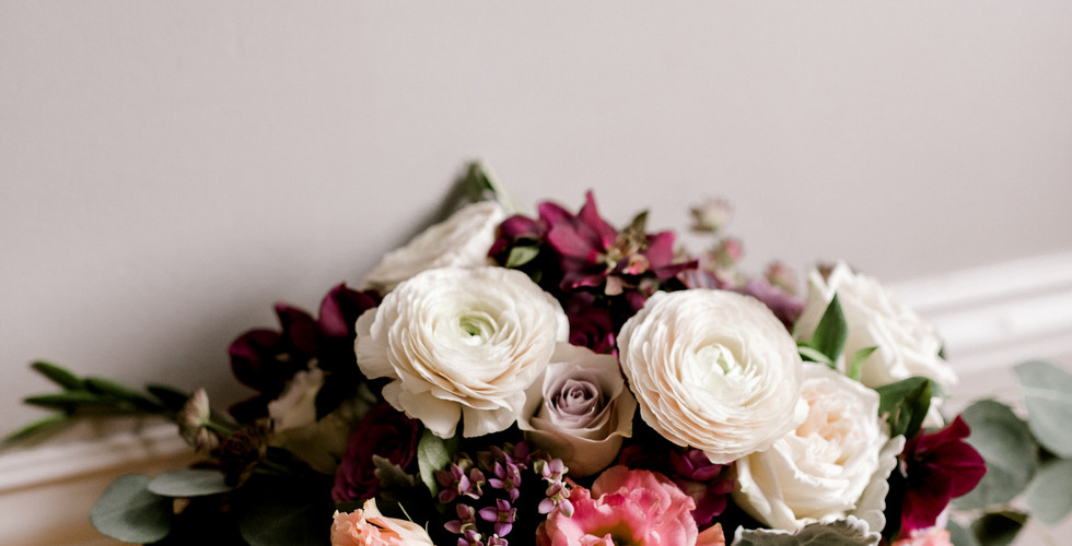
We used plum and pink for our saturated colors in this bouquet shot by Annmarie Swift. We then added blush and lavender to compliment the pink and plum. We also added white... because we all know how much everyone loves a neutral and a white dress!
Don't choose opposite colors on the color wheel. While this can be fun, it takes an extremely careful eye and can go epically wrong. To play it safe choose colors no further than one apart on a color wheel.
Choose All the Colors:
DO choose colors that speak to you and "spark joy".
DO choose colors that are split complimentary or analogous colors. Choose to make at least two of the colors next to each other on the color wheel.
DO choose to incorporate at least one pastel. This helps by softening the pallet to make it appear harmonious.
DO try to incorporate each color multiple times, whether that is a saturated color or pastel. For example the burgundy in the photo below is used once for the Dahlias and Once for the foliage (Cotinus).
For this bouquet, shot by Heather Nicole photography, we used 'Coral Sunset' peonies, 'Baronesse' Garden Roses, Burgundy Dahlias, Cotinus, 'Juliet' garden roses, 'Free Spirit' roses, red celosia and (red) Gloriosa lilies.
When using lots of saturated colors it's also important that some of the colors speak to each other. For example the creamy yellow parts of the Gloriosa lilies and the centers of the peonies. Also the centers of the peonies and the 'Free Spirit' roses. These details bind the pallet together and give more movement and relativity for your eye to follow.
DON'T try to match your flower colors to a your bridesmaid dresses. It's next to impossible and mother nature doesn't really work that way. Try choosing multiple shades of that color and adding them to the bouquets. It will all look harmonious, won't clash and the flowers won't disappear into the dresses.
Try to keep in mind that flowers can change color slightly depending on how much sun and water they get while growing. Also, just because you find and exact floral shade of blush that speaks to you on Pinterest, doesn't mean it's real. Sometimes photographers manipulate colors through their process by filtering and editing images. This can change and alter the shade of the flowers that you thought were perfect. Keep an open mind and try to listen to the suggestions of your floral designer.
We LOVE working with color!
If you are thinking of working in some color for your bouquets or flowers, don't be scared! We can help you! We love working with color and love to help your vision come to life! While there are many many ways to make a pallet work, these are just a few quick tricks to help.


